Who is JIGZ?!

My photo
Manchester, United Kingdom
Welcome to my BLOG! Im Jigz currently living in Salford in Manchester, studying Design For Digital Media (D4DM) at The University Of Salford. Im a graphic design enthusiast and it is what i specialize in :D, my main area's are Branding and Re-Branding, but i am flexible in different areas. | Come find me on Twitter - @26jigz | E-Mail - jignesh.lad26@gmail.com | Skype Jigz26 and Jigz262 | Enjoy!!!
Showing posts with label Design. Show all posts

Monday, 25 June 2012

Ecstasy Boutique | Branding

Well now I finished uni this is a project that is in the making for a friend of mine for her new shop she is starting up.

The shop will be selling unique made clothing by the owner and to show the organic feel to the company they have gone for the idea of having a vintage styling with add of pin up girl.


The approche I took on this was having a banner with a grunge feel and with the pin up girl to be more flashy and working them together.

I started off by drawing them out and paper which would speed up the process of  designing the logo.

\
This is the first phase of the logo some more needs work needs doing to it with the arrangement of the type and then working on the grunge look further.

Thursday, 31 May 2012

Dissertation | UR Voice: Poster campaign

*/ Art work update /*


Right this has been long awaited since I had started this project, the purpose for this was that we was given an option for our dissertation to do on of the following:


1. A full 8-9000 word essay on our chosen subject
2. 30 mins presentation and 5-6000 word essay
3. An Art piece followed by a 3-4000 word essay


So I had chose to go down the route of doing option 3.


My topic for the dissertation was 'Does graffiti and protesting give a voice to the public?'. I had chose this because the recent and previous stories in the media about countries going into the recession, going to war and other political issues that are going on.


As well as these stories coming there is always some kind of protest, graffiti or opinion pointed out through letters, posters and over social media platforms. This is what had caught my eye into the topic which is is their/our voice heard by the government or any other high authorities.


Where my project had differed was that I had gone out to ask the public them selves what they feel about the things that surround them that are dealt by the government. 


As spoke about in my previous post about my dissertation (http://alturl.com/3ev5j) they had come up with a lot points that they thought that had effected them if not themselves but also those around them they don't even know.


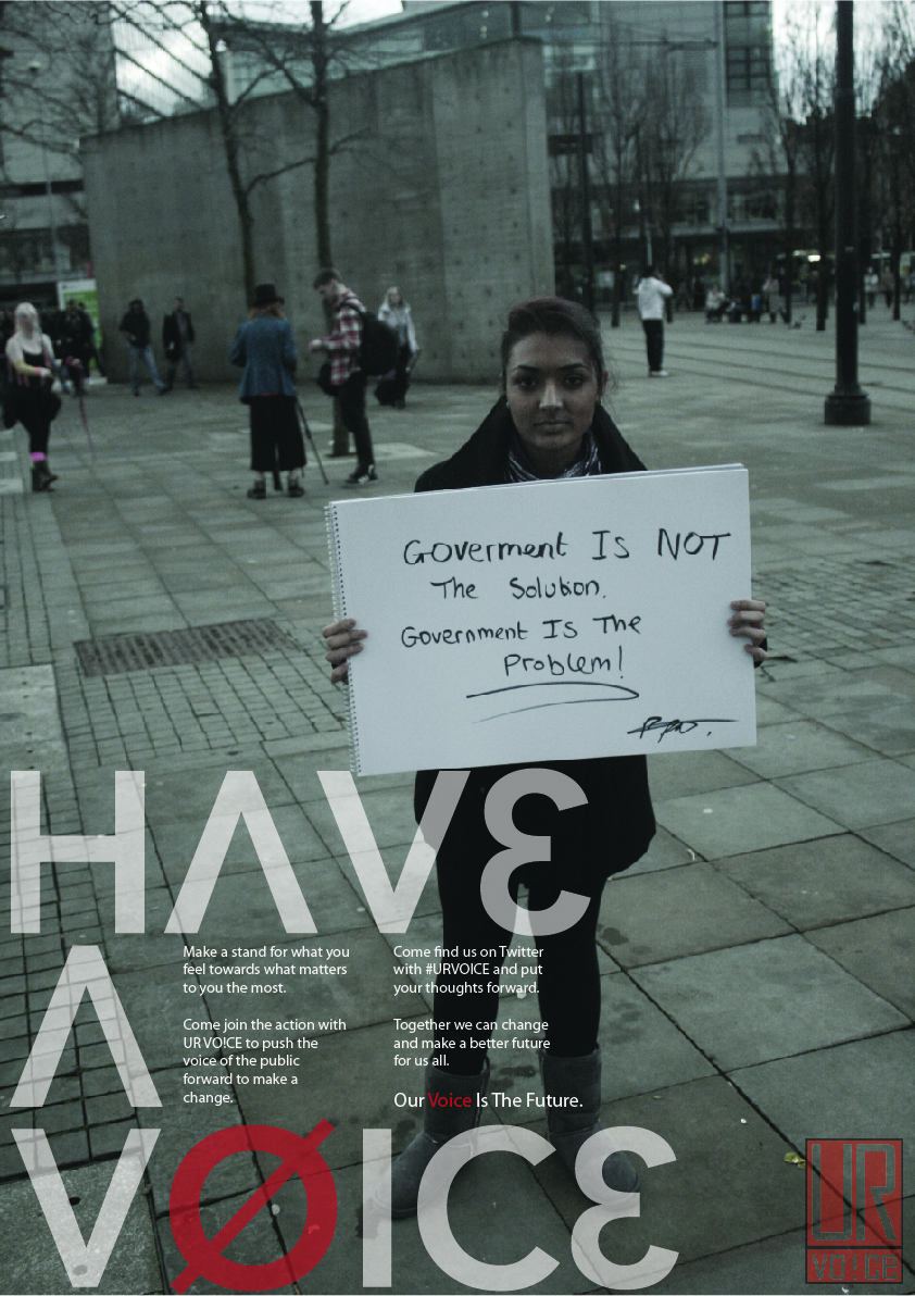
After gathering the feedback I had selected a few to then place them into a poster with a photo of the person holding up their views. (the following people did give me their consent to use their photos for my project)


Posters:


The point of having the environment that they are in included in the image was to show off their characteristics and what kind of vibe it has within the place they are in. Some of these are taken through out of Manchester City Center and some are done in the Affleck's Palace and around the Northern Quarter. 


By the way the colours that are set on these posters are not of those that are done in print for some reason they have come out a lot darker on computer sorry!


On the left and right are the final out comes of the posters and the tones of the actual images are done to set the tone that the campaign is serious as well as the messages are serious and should be taken into consideration.


The type face I had used was custom because the nature of the campaign mainly revolve around the do's, dont's, money and right from wrong soo that's why the interrogation of the numbers and symbols have been done.


For the final out com of the poster here is an example on how they would look if they where placed into an ad shell in the city center:


Sorry for this being a blagh of a post but on a serious note this is something important to consider when it comes to what you may think the future will/would be like if the voice of the public is not put into consideration. We have a right to choose what kind of world we live in and I think like the rest of the people I have spoke to we should be able to have the right to air this.


I would like to thank again those who had helped out through this project which are named in the last post and also the following: 


@alimkarmali / http://whole-meal-bread.blogspot.com/
@ThreeSixtyDave / @MaquinaMusic
@mslowhitney
@Molliehaq
@LeoniHarry12
Jake - http://www.youtube.com/ArcaneIllusions


Thank you for taking your time to have a look at this post and I hope you have enjoyed it :)

Wednesday, 2 May 2012

D4DM End of Year Show | Branding

This is my second proposal to the branding idead.

An addition to the notes made on the board the peaks that are caused for the mountain idea they all depend on how confident the designer is in that certain area.


All colour pallet is set on the Adobe creative suite but as discussed at uni we have still more to explore in the identity we choose for this end of year show.

So there will be more updates made to this and will be posted.

Tuesday, 1 May 2012

D4DM End of Year Show | Branding

Well the end is upon us and the show must go on....

Here is my proposal for my end of year show and how I have come up with the branding with reasoning to the colour palette and origami styling to logo type.


For this I have taken in consider that as all designers our key tools of trade is the Adobe Creative Suit and for the end of year show this is what I have designed.

Each colour way is disciplined to a job role in which will be carried out as a group on the D4DM course and to suit those roles each Adobe application that is used to do so is assigned to that job via application colour.

The header and complimentary type are chosen due to how much of an effect they have on the viewers eyes, I wanted it so that even when reading something bold your not struck by over powering type and yet when reading sub messages the type is not too thin yet to over powering.


Friday, 11 November 2011

Presentation & Communication Design


Having a stressful day with the presentation for the Hatton work, now I have started another assignement which I have an option of briefs that I can choose from.

The first brief I am looking at is the communication campaign for 'The Feel Good Drinks Company' to make them stand out more on the shelves and also for the knowledge of the public.

The second brief I am interested in is one for the 'ESPN' which is another communication lead brief which is to push out the identity of the ESPN to a younger audience in the UK.


ESPN Brief: http://awards.ycnonline.com/briefs/view/espn/

Feel Good Drinks Company: http://awards.ycnonline.com/briefs/view/the-feel-good-drinks-company/