Who is JIGZ?!

My photo
Manchester, United Kingdom
Welcome to my BLOG! Im Jigz currently living in Salford in Manchester, studying Design For Digital Media (D4DM) at The University Of Salford. Im a graphic design enthusiast and it is what i specialize in :D, my main area's are Branding and Re-Branding, but i am flexible in different areas. | Come find me on Twitter - @26jigz | E-Mail - jignesh.lad26@gmail.com | Skype Jigz26 and Jigz262 | Enjoy!!!
Showing posts with label logo design. Show all posts

Thursday, 7 February 2013

Cassie's Cakes | Branding

I have got a new client called 'Cassie's Cakes' and this young lady makes custom cakes/cup cakes for all occasions whether it is birthdays, christenings and weddings etc and she has some good cake talent.

SO basically Cassie needs an image in which establishes what she does and in which she wants to appear to the customer.

my approche to this is having an identity that will fit with the range of designs she does which is a mixture of kiddy, stylish and creative designs. So what I have done is gone through various typography to suit the image of being a cake maker and making easily transferable.


Below are the designs and colours that had been narrowed down to but the colours are not set on.


The styles are more homely with how the type is set in the circle and the choice of two typefaces are to resemble a more feminine touch in the name Cassie then hitting it with the slick calligraphy type in cakes to show the artistic flare in which that the cakes Cassie make.

The typefaces are fitting with the image of a high end deli/confectionary business.

Moving on from the designs they had been further narrowed down to three designs and a colour pallet that was chosen by the client.

Colour pallet

Above is the colour pallet that I had come up with which agreed with the client is how they wanted to look and the various tones that are there to give off.

The colours are not heavy on the eyes also having them blend together is easily done but further more it gives off a cool and relax balance to the logo and how you feel when looking at the brand.

Next approach was to apply these colours to the chosen three logos to see a match.


The final three designs have now been added to final addition of the new pallet in which the client will pick on which colours she feels suits her more to take further to her business cards.

The design and approche to this branding has been to minimize the cost of promoting down. So the with the style being circle the client is able to get them printed on circle stickers which then can be added to the plain white boxes she places her cake in as form of catering identity and advertising and the addition of business cards which will be designed next a form of connecting with people then soon to move on to Facebook page to show her work, promote and most important customer feed back.

Lastly I would like to thank Christine Charnock (UNI BUDDY) for providing me this lead in help with freelancing I appreciate this a lot. check her out christinecharnock.co.uk and Twitter @c.charnock.

Monday, 25 June 2012

Ecstasy Boutique | Branding

Well now I finished uni this is a project that is in the making for a friend of mine for her new shop she is starting up.

The shop will be selling unique made clothing by the owner and to show the organic feel to the company they have gone for the idea of having a vintage styling with add of pin up girl.


The approche I took on this was having a banner with a grunge feel and with the pin up girl to be more flashy and working them together.

I started off by drawing them out and paper which would speed up the process of  designing the logo.

\
This is the first phase of the logo some more needs work needs doing to it with the arrangement of the type and then working on the grunge look further.

Wednesday, 2 May 2012

D4DM End of Year Show | Branding

This is my second proposal to the branding idead.

An addition to the notes made on the board the peaks that are caused for the mountain idea they all depend on how confident the designer is in that certain area.


All colour pallet is set on the Adobe creative suite but as discussed at uni we have still more to explore in the identity we choose for this end of year show.

So there will be more updates made to this and will be posted.

Tuesday, 1 May 2012

D4DM End of Year Show | Branding

Well the end is upon us and the show must go on....

Here is my proposal for my end of year show and how I have come up with the branding with reasoning to the colour palette and origami styling to logo type.


For this I have taken in consider that as all designers our key tools of trade is the Adobe Creative Suit and for the end of year show this is what I have designed.

Each colour way is disciplined to a job role in which will be carried out as a group on the D4DM course and to suit those roles each Adobe application that is used to do so is assigned to that job via application colour.

The header and complimentary type are chosen due to how much of an effect they have on the viewers eyes, I wanted it so that even when reading something bold your not struck by over powering type and yet when reading sub messages the type is not too thin yet to over powering.


Monday, 16 April 2012

Final Major Project - Swarve @ Gooey Creative | Catch Up

Wow its been a while since I have updated what I have being doing for Swarve sooo here is a quick catch up on where I am at with this project.

Here is the final logo that the client had chose for the branding of the online shop:

Final Logo


Following on from this I had started looking at what is already around from the upper-class range in styles and also online shops that sell clothing though would be in comparison to 'Swarve'.

Mood Boards


These mood boards are showing they types of profiling that 'Swarve' is aimed towards and also the other companies that are already out there when it comes to high end mens accessories whether that is through direct name brand or through 3rd party sellers with online shops.

Website


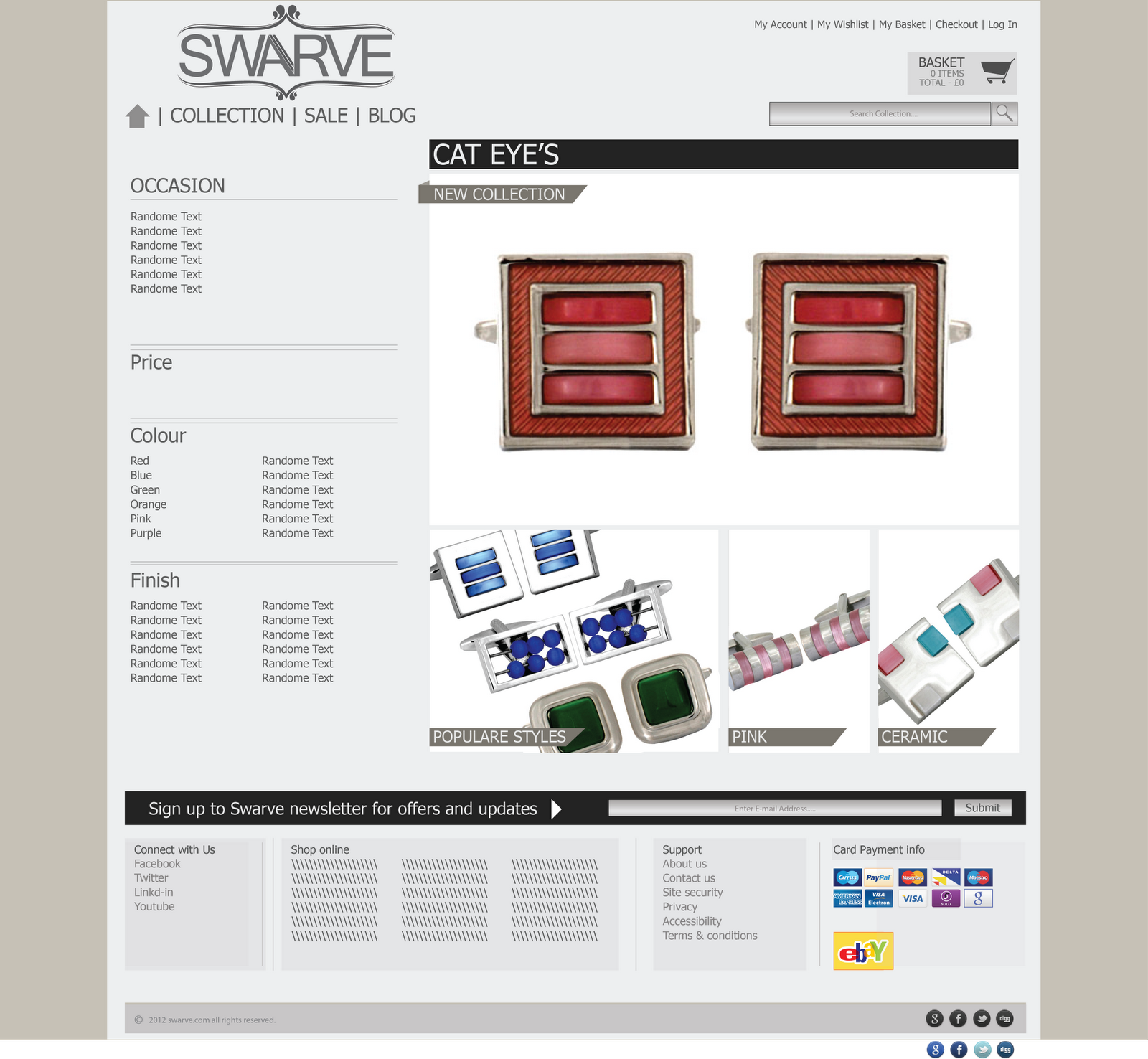
Above are two variations of how I had imagine the home page to look for the client. The thoughts behind this was to keep it like a catalogue styling so that the appearance would not be too heavy on the eyes with many images scattered around but to have a hero shot at the top and then simplify the seasonal information towards the bottom.

The colour scheme as of yet has not been decided on but following on through the process the scheme has been chosen by the client.

At the bottom of the page there are the key information that is needed to ensure that the user are informed abou the card options that are available to pay by and also accessibility.

Site layout


This site layout shows the the linkage between the pages that are on the site and how the flow of the website will work.

following on from this I had mocked up how the content would be laid out when one of the collection range is chosen.


Collection Layout


Moving on I had added some content to the pages on certain products to show how they would be shown on the site and further more going on to buying how the page would be shown for more information and quantity selection.

To cut this short I have chose a selection of pages to show saves it getting long a boring because layout wise they are the same but just the content that differs. 


Selected pages with content


The website is going to be authored in Wordpress and Magento for selling online.


(Sorry for the long catch up XD)

Friday, 30 March 2012

Final Major Project - Kitchen Components

Yup its been a month since I last posted sorry!! ha
Well heres an update on my Kitchens Components brief I have a lot more to upload soo watch out
jus need time to gather them together and upload em here.


Monday, 20 February 2012

Self Branding

After a busy weekend working, I have continued my self branding brief with a re design of my logo.
These are 6 slides showing the development of the logo and the reasoning behind the final 3 designs.

Leave your comments on what you think of the designs please.


Thanks


Tuesday, 7 February 2012

Mr Swarve / Swarve Branding


Working on a new project at Gooey Creative which will be leading into my final major project.
The company is called 'Mr Swarve' or 'Swarve' the name is not set yet soo the logos that are designed are based on both names that are stated.

The image the company wants is similar to 'Armani', 'Hugo Boss' so keeping them in mind the logos had been created.